“Audit” isn’t exactly a nice word.
In fact, it probably brings to mind taxes and the IRS.
(Yikes!)
But, today, we’re going to dive into how you can use a ‘website audit’ to clearly identify key features on your site that need improvement over the coming months.
It’s all part of the ‘never done’ mentality you’ll need to build and maintain a winning professional speaker website.
To get started, let me introduce you to a speaker who has the perfect mentality when it comes to making improvements to her speaker website.
Meet Kassy LaBorie

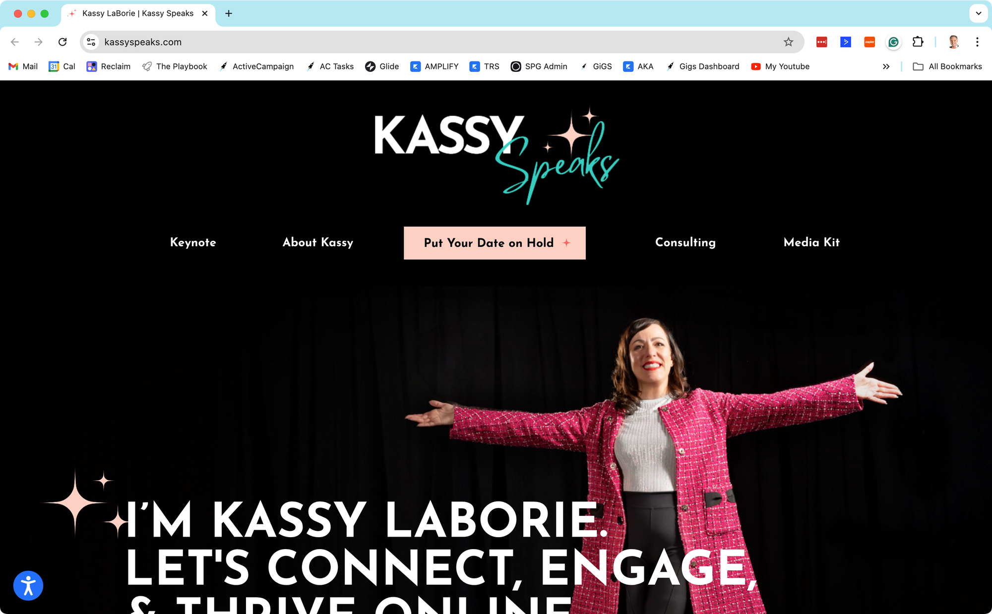
Several months ago, I was approached by Kassy LaBorie – a rockstar in the world of virtual training. For years, Kassy’s consulting business has been successfully teaching people how to train and present effective and engaging live virtual training and webinars.
Over the course of her business’s lifespan, she has built an extensive consulting website that includes nearly all of the top features she’d need to win new business and present herself as a pro.
But, more recently, Kassy has been pondering how to position herself first as a keynote speaker. This is a question that crosses the minds of many speakers, so definitely go back and check out our recent article to learn more.
When Kassy contacted me, we discussed how I could help her strengthen her new dedicated speaker website with a professional website audit.
(Note: Depending on when you read this article, you may or may not see all of the updates. As we recommend, Kassy is viewing this as a work in progress that will improve over the coming months.)
How Will You Take the Criticism?
It is hard to put your energy and passion into a project only to have someone else point out flaws.
Andrew recently told me about some session description reviews he did for fellow speakers. Many of them were really bummed with the many suggestions for improvement he shared.
So, regardless of if you have someone else do an audit, or if you do it yourself… you need to consider how you will use this new information.
- Will you feel badly about the many things you find that could be changed? Will you dig in your heels and try to deny the need for improvements? Worst of all, will you disregard the entire audit process and fall back on inaction?
Or, will you take the other road?
- Will you recognize the criticism as a win – since it gives you a clear idea of what can be changed – to make your site even better? Will you commit to not taking things personally or getting embarrassed just because some things could be changed? Will you approach the process with positive energy, ready to tackle and fix issues one step at a time?
I’m happy to say that Kassy was definitely in the second group. Although I gave her a very long document filled with recommendations, she took the new information and plowed ahead with a positive attitude.
And that doesn’t do anyone any good.
Be like Kassy. 🙂
How to Conduct a 28-Point Speaker Website Audit
Okay, friends. Buckle up, because here is the entire process – soup to nuts.
Along the way, I’m going to share a few examples of improvements we identified for Kassy’s site or other speaker websites I’ve reviewed.
With each item, take some time to consider how your own speaker website measures up. And be brutal with your criticism. The more things you can identify and improve, the better your site will be over time.
As a side note, the first 10 items on this list are ‘must haves’ Andrew talked about in this earlier article. Then, we’ll dive into some more technical bits.
1. Call-to-Action
A clear CTA tells the visitor exactly what you want them to do.
For most speakers, this CTA button should be located very prominently on your site with instructions to “put a date on hold.”
Kassy’s speaker site had a beautifully placed and designed button. I did encourage her to add additional fields on her form so she could gather as much information as possible from her prospects.


